8
BIT BEAN CO.
8 BIT BEAN CO.


Visual Communications
Capstone Project
Challenge:
As part of a senior capstone project, I played the role of an entrepreneur, developing the idea for a business, including products, promotional items, and brand identity guidelines.
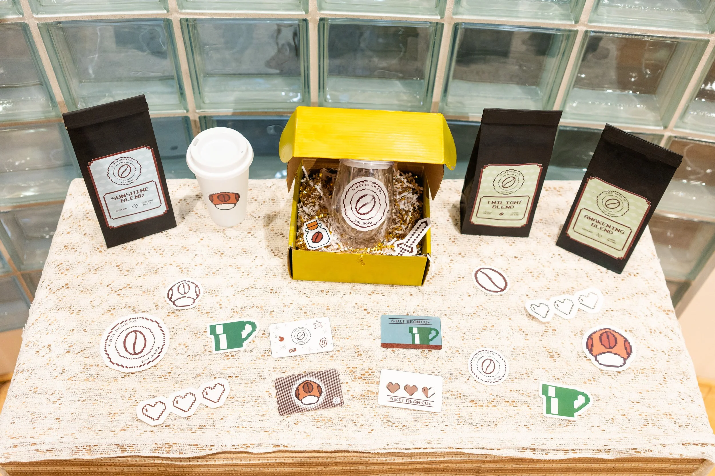
Solution:
My business combined two of my passions: coffee and video games. I drew inspiration from both to develop the concept for “8 BIT BEAN CO.” Coffee flavors, including “Twilight” and “Awakening” blends offered a nod to popular Nintendo franchises. Product packaging, gift cards, and promotional materials, including T-shirts, mugs, and stickers, reflected the simple nature of 8-bit graphics and well-loved video game elements. I also developed brand identity guidelines to ensure consistency in the 8 BIT BEAN CO. brand experience.
Brand Color Pallet
〰️〰️
Brand Color Pallet 〰️〰️
Why these colors
These colors were chosen from some of the most popular Nintendo franchises. The main colors used are brown and blue. These colors were chosen as they are earthy and cool undertone which is often associated with coffee and coffee shops. They are also playful to reflect those fun times spent gaming late at night. Colors can be shown with no less than 80% transparency to retain the true color. In order for colors other than those listed above to be used they must be discussed with 8 BIT BEAN CO. and must be approved. If color is not listed above, licensing must be located on the product to determine validity.
R
134
99
244
148
240
G
166
41
242
191
5
C
51
37
3
45
0
M
24
80
3
8
98
Y
33
100
3
64
80
K
0
52
0
0
6
166
B
0
241
128
48
Merchandising Mockups
-

Sweatshirt - Hoodie
Red - Full Front Emblem
-

Sweatshirt - Hoodie
White - Left Chest Emblem
-

Sweatshirt - Hoodie
Green - Full Front Emblem
-

T-shirt
Green - Left Chest Emblem
-

Tote Bag
Level 1 Tote
-

T-shirt
Red - Left Chest Emblem
-

Crew Neck
Green - Left Chest Emblem
-

Crew Neck
Red - Left Chest Emblem
-

Crew Neck
Brown and White - Left Chest Emblem